Objective
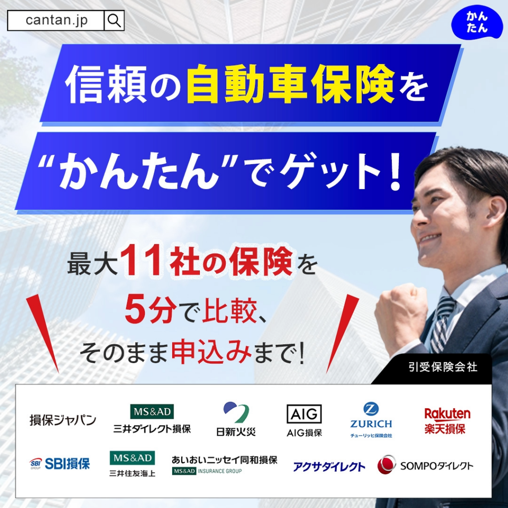
Promotion for the car insurance comparison platform “Kantan”
Requirements / Specifications
- Desired colors/style: Blue tones (fresh, trustworthy, cool)
- Size: Square, 1080×1080 px
- Delivery format: PNG
- Platforms: Multiple social media channels
Design Approach
The main headline, “Choosing Car Insurance,” was emphasized to clearly communicate the purpose of the banner and increase user engagement.
To ensure the most important elements stand out and the content can be understood at a glance, typographic hierarchy was applied: key phrases are prominent, while less critical text is subdued for visual clarity and contrast.
Since the target audience is male, a simple sans-serif typeface was used for readability and a clean, professional appearance.